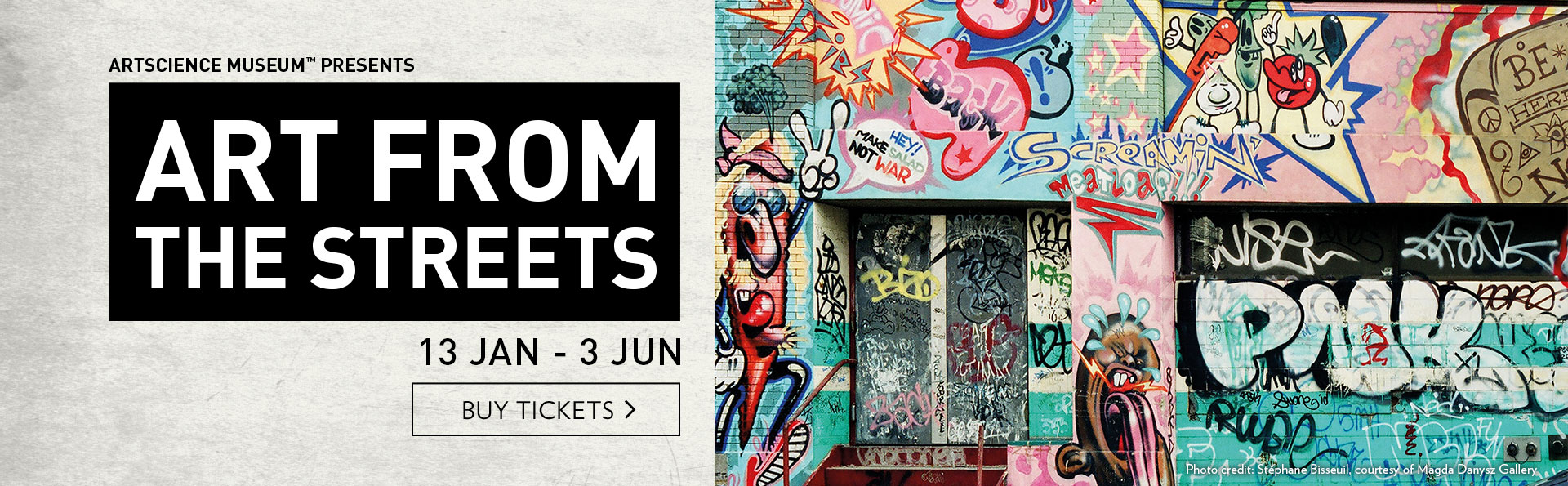
涂鸦最初于1960年代末起源于费城,而非纽约。至1970年代初,纽约地铁上开始出现带有某种设计风格的姓名缩写及署名,也即后来所称的涂鸦“签名”(tag)。街头艺术正是从那时起,逐渐被更多的公众所熟识。
各种相关的视觉表现“代码”也是在那段时期开始形成,并一直沿用至40年后的今天。Blade以及素有“涂鸦教父”之称的Seen等街头艺术家被视为早期的涂鸦大师,他们的知识、技巧和手法被代代传承下来。这些艺术家从简单的墙上涂写起步,逐渐形成独特的风格,并为创新艺术形式的诞生和发展奠定了基础。
1970和80年代的作品通常被称为“老派”涂鸦,其风格如今看来依然鲜明可辨。无论是在地铁、墙面还是画布上,这种用喷罐在所选表面进行创作的方式与街头艺术有着千丝万缕的联系。相关创作实践后来演变成为一种风潮,在这个过程中A-One、DONDI 或 Futura等人发挥了关键作用。他们一边大胆尝试,一边想方设法倾注自己的热情。他们的早期作品大多是在肾上腺素飙升的状态下,在相互竞争仿效的过程中完成,因此往往充满活力且风格独特。
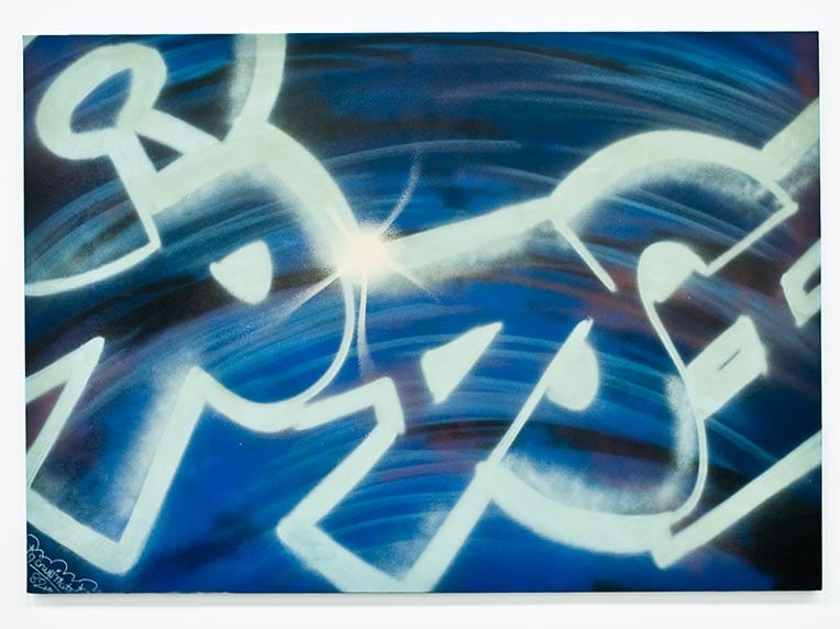
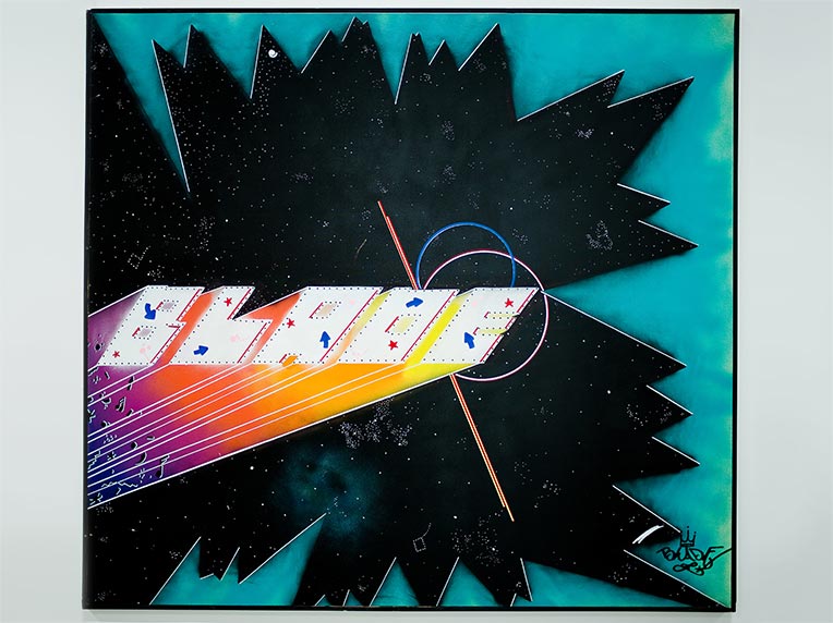
Crash (b. 1961)
Untitled, 1982
Spray paint on canvas
Lourdel Collection
Photo: courtesy of Stéphane Bisseuil

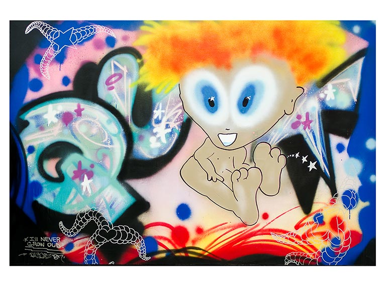
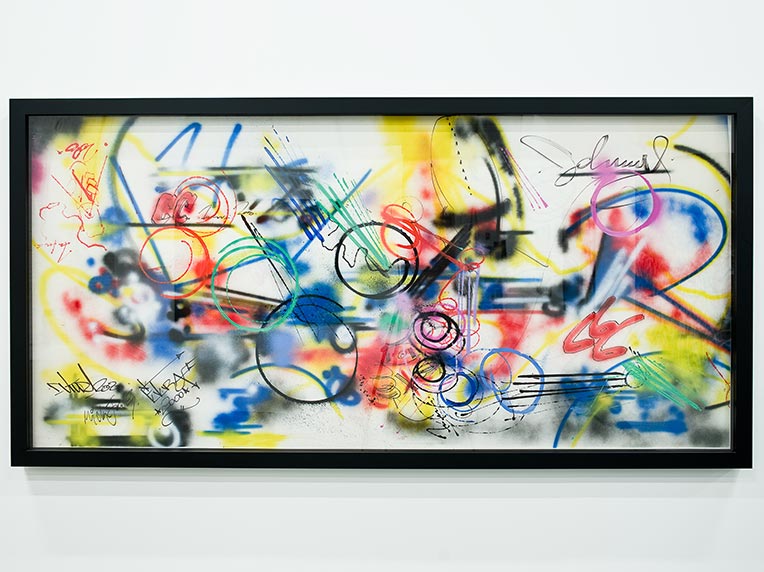
QUIK (b.1958)
I'll never grow old, 1987
Spray paint on canvas
Lourdel Collection
Futura (b.1955)
Untitled, c. 1982
Spray paint on concert background
Lerouge Collection
Photo: courtesy of Stéphane Bissseuil
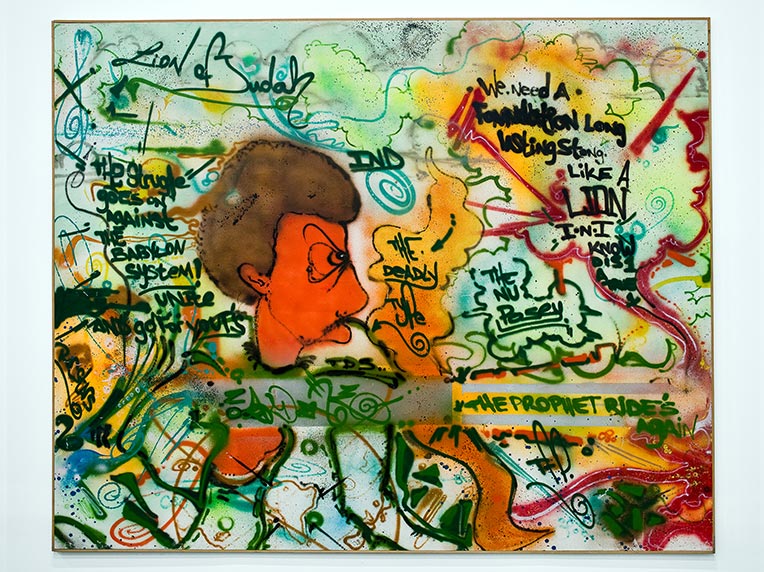
A-One (1964–2001)
The Babylon System, the Prophet, 1985 Spray paint on canvas
Private Collection
DONDI (b. 1961)
Untitled, 1984
Spray paint on canvas
Private Collection
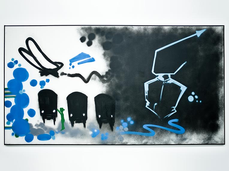
Blade (b. 1958)
Distant Traveller, 1987
Spray paint and marker on canvas
Blade was only 15 years old when he formed the Crazy Five Crew. He was later nicknamed the “King of Whole Cars” after having spray painted 5,000 subway cars in total on lines 5 and 2 of the New York subway between 1975 to 1980.
Blade’s contribution to graffiti culture is fundamental as he was the first artist to develop the entire composition around an initial tag. With this approach, the trend was not just about writing one’s name as big as possible but also about the careful choice of colours and the addition of objects and symbols to the composition, as well as the use of perspective and geometry.